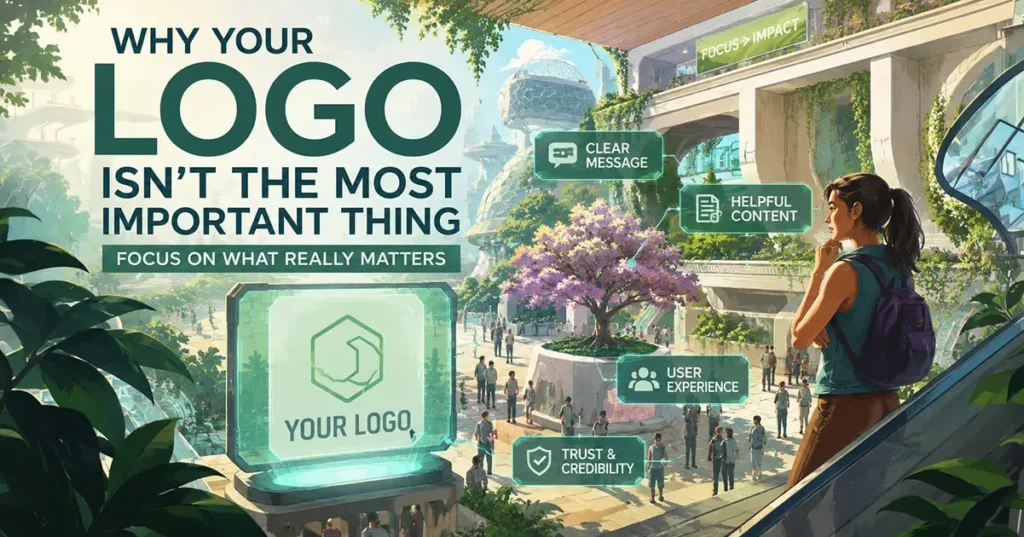
Why Your Logo Is Not the Most Important Element of Your Website
Is a massive logo hurting your website’s user experience? Learn the true cost of logo bloat and how to optimize your above-the-fold real estate using UX psychology and conversion architecture.
Many small business owners and founders believe that their logo should be the centerpiece of their website.
It is an understandable instinct. A logo represents the birth of a business. It is often the first tangible asset an entrepreneur invests in, carries deep personal pride, and feels like the core identity of the company.
However, as a digital strategist and UX designer, I frequently encounter a recurring pattern with new clients. They don’t just want their logo in the standard header. They want it:
- Maxed out in the hero section.
- Repeated across mid-page sections as a watermark.
- Floating above every Call-to-Action (CTA).
- Scaled larger than the actual value proposition messaging.
One of my primary responsibilities during the discovery phase is to gently guide clients away from this approach. Not because logos lack value, but because high-converting websites prioritize user intent over corporate ego.
The Reality of User Psychology: What Visitors Actually Care About
The harsh truth of web psychology is that cold traffic does not care about your logo. When a user lands on your site, they are evaluating your business through a framework of immediate self-interest. They are subconsciously asking:
- What do you do? (Clarity)
- Can you solve my specific problem? (Relevance)
- Are you legitimate? (Authority/Trust)
- What do I do next? (Frictionless Navigation)
Your logo validates the answer to question three by proving you are a legitimate entity, but it cannot answer questions one, two, or four. Modern web design is not a digital business card; it is a conversion engine. When branding overwhelms clarity, conversion rates suffer.
The True Cost of “Logo Bloat”
Forcing excessive branding onto a page—particularly in the hero section—creates two distinct problems for your website’s performance:
1. The Destruction of “Above-the-Fold” Real Estate
The hero section (the visible area before a user scrolls) is the most valuable real estate on your digital property. Users decide whether to stay or bounce within 0.05 seconds.
According to eye-tracking studies, users scan websites in an F-shaped pattern, looking first across the top and then down the left side.
[ LOGO ] ------------------- [ NAV MENU ]
  |
  |-- [ HERO HEADLINE: Your Value Proposition ]
  |
  |-- [ Subheadline / Proof ]
  |
  |-- [ CTA BUTTON ]
If a massive logo dominates this initial scanning path, it creates cognitive load. The user has to work harder to find the actual message, increasing the likelihood that they will leave.
2. The “Nike Illusion”
Enterprise brands like Apple, Nike, or Starbucks can launch minimal, logo-centric landing pages because they possess billions of dollars in established brand equity.
For local businesses, B2B firms, and startups, that recognition does not yet exist. You cannot rely on a symbol to communicate your value proposition; your copy and layout must do the heavy lifting.
What Actually Establishes Digital Authority?
In the mid-2020s, trust is built through seamless User Experience (UX), not graphic repetition. If you want a website that commands premium pricing, focus on these fundamental pillars:
| Design Element | Strategic Impact on the User |
| Micro-Copy & Headlines | Instantly communicates the core benefit and qualifies the lead. |
| Visual Hierarchy & White Space | Gives elements room to breathe, directing the eye naturally toward the CTA. |
| Social Proof (Reviews/Case Studies) | Transfers trust from peers to your business far better than a logo can. |
| Core Web Vitals (Speed & Responsiveness) | Proves technical professionalism; a slow site with a beautiful logo is still a failed site. |
Your Website is a Funnel, Not a Billboard
A billboard on a highway relies on passive, high-impact interruption. A website relies on active, structured interaction.
Users do not visit a page to memorize your iconography. They visit to accomplish a task. The goal of top-tier web design is to move a user effortlessly from curiosity to conversion.
When a logo plays a quiet, disciplined role—properly scaled in the top-left header, serving as a subtle anchor of brand consistency—it allows the conversion architecture to do its job.
Executive Summary
Customers rarely buy because of a logo. They buy because a website feels intuitive, speaks directly to their pain points, and offers an frictionless path to a solution.
Shift your mindset from showing who you are to showing what you can do for them. Scale down the logo, scale up the clarity, and watch your conversion rates respond.
What do you think?
Does this updated version match the level of authority and depth you were hoping to see?